Case study
Lendlease Rebrand
Client
Lendlease
Agency
Houston Group
Role
Caroline Gilroy, Head of Art
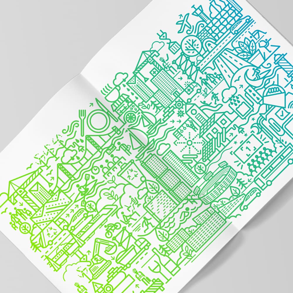
A large-scale rebrand for Lendlease focused on creating a more flexible and multidimensional identity system. The core idea was a living graphic language, known as “The Fold”, that could stretch across consumer, business, enterprise, government, local, and international contexts without losing coherence.
Overview
A brand system built for scale and variation
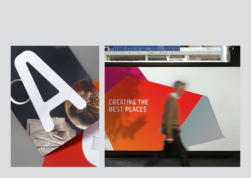
The rebrand needed to celebrate the diversity of the organisation while still feeling recognisably singular. The resulting system created room for differentiation across the business, while holding together as one connected identity.
Core idea
The Fold acts as an evolving form and a graphic device, giving the identity a flexible structure rather than a single fixed expression.
Design goal
Build a system that could move from consumer to enterprise and from local to international application without losing clarity or recognisability.
Scope
Brand Guidelines and Design / Rollout across a large and diverse organisational system.

System
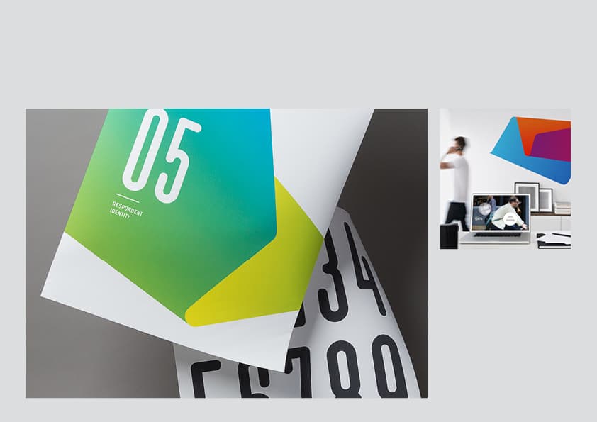
Flexible enough for a complex business
The identity system had to support multiple audiences, organisational layers, and communication contexts without becoming rigid or generic.
Identity system
A multidimensional visual language designed to flex across business units, audiences, and market contexts.
Guidelines
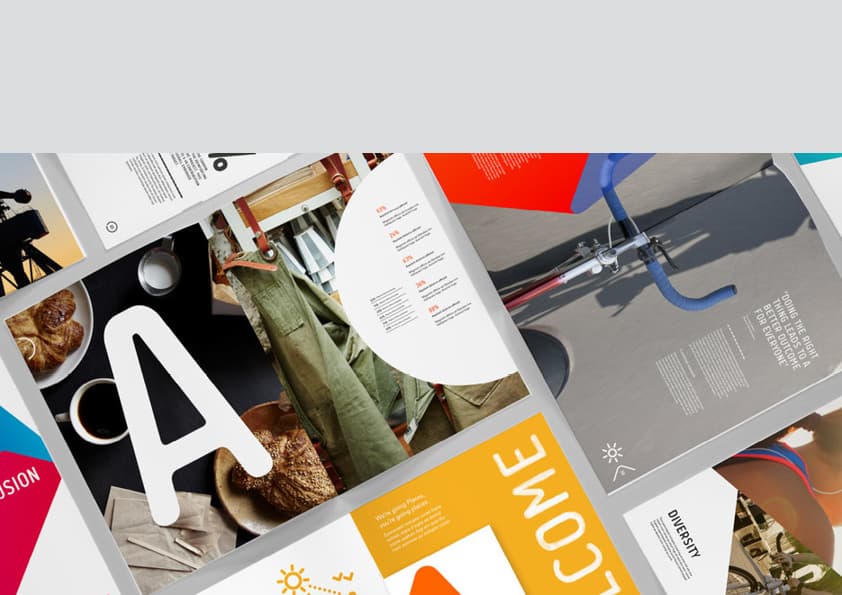
A brand system robust enough to support rollout, governance, and day-to-day application across a complex organisation.
Rollout
A practical design framework for extending the identity across consumer, enterprise, government, and international touchpoints.
Contribution
Head of Art across identity and rollout
Brand identity development
Design system thinking
Guidelines and rollout structure
Cross-business brand application
Delivery note
A system designed to stretch without breaking
The Lendlease rebrand demonstrates how a strong design system can hold complexity without flattening it. The Fold gave the brand a flexible, recognisable language that could adapt across multiple audiences, formats, and business contexts.